Death Wish Coffee Co.–Flavored Packaging Architecture |
Creative Direction & Packaging Design
The Challenge
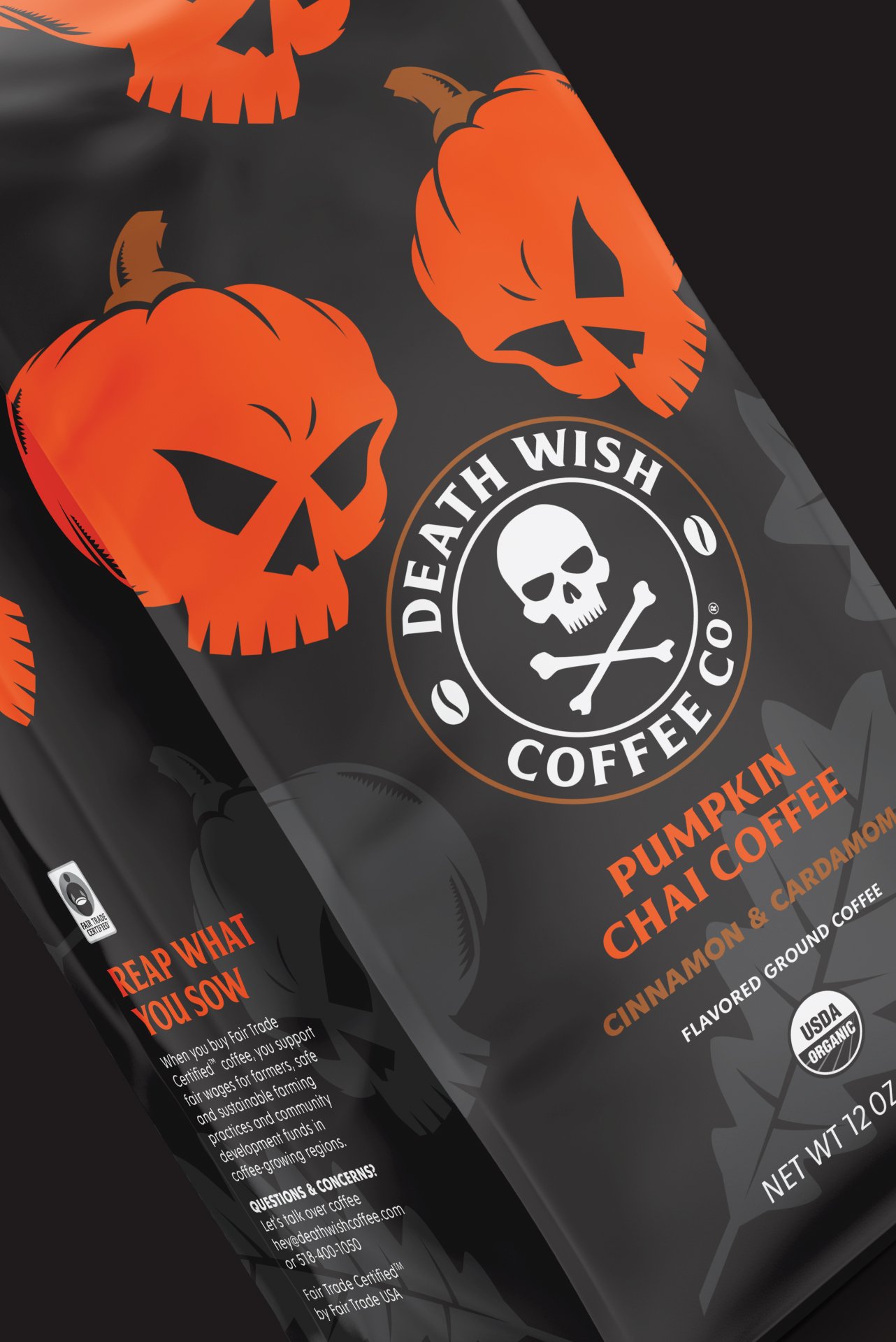
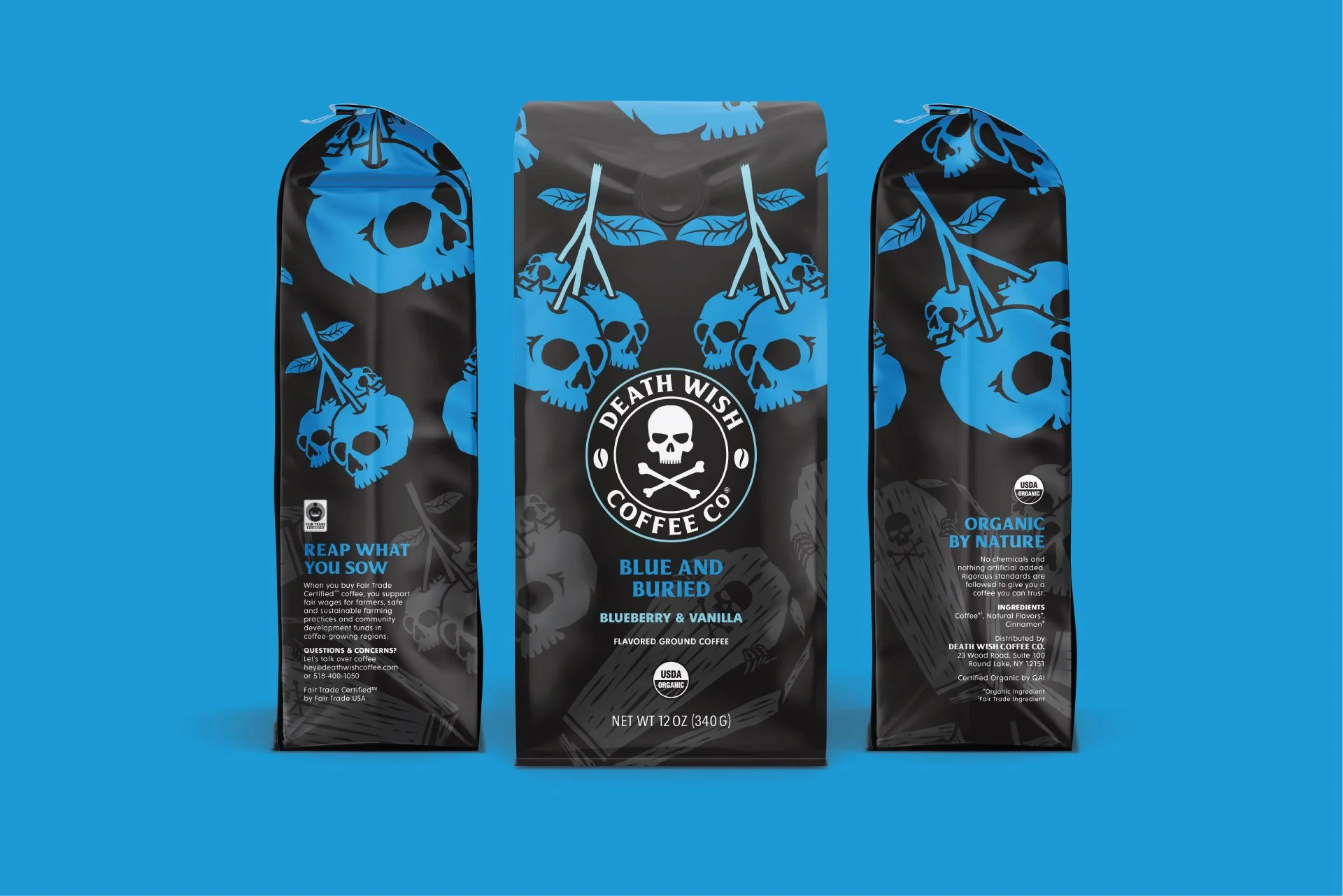
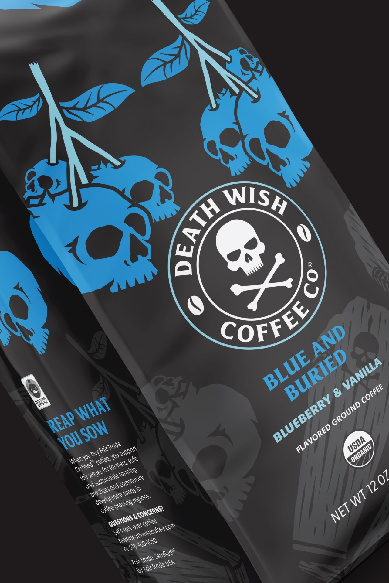
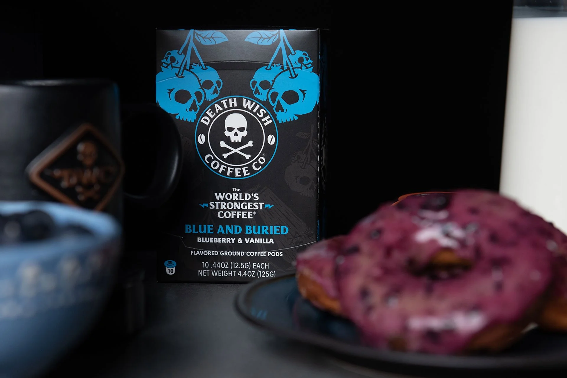
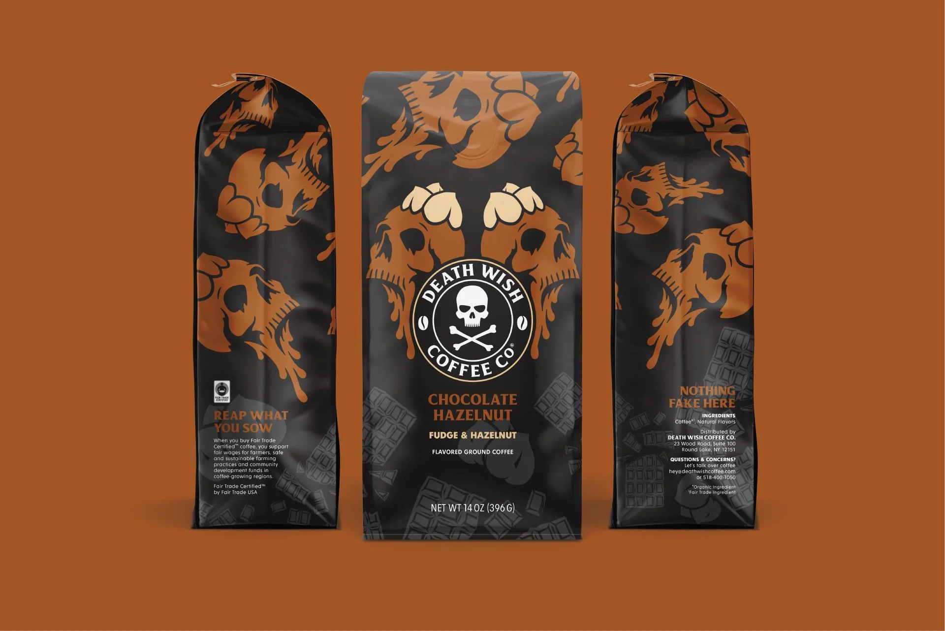
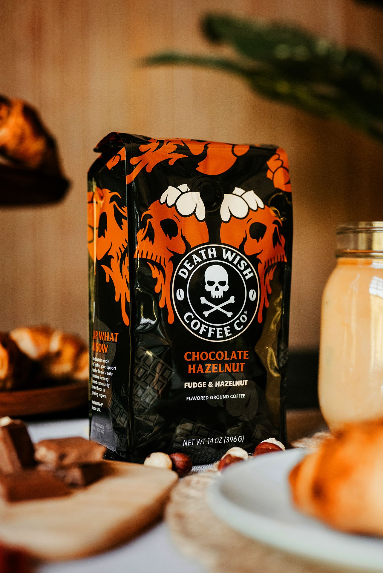
Death Wish Coffee, known for its no‑nonsense, high‑octane persona, approached a seasonal flavored line beginning with Pumpkin Chai—with caution. The core challenge: develop packaging that remained rooted in the brand’s rebellious identity while welcoming categories traditionally associated with gimmicky flavor offerings. The goal was to stand out, maintain brand integrity, and command shelf presence in a cluttered market.
My Approach
I anchored the packaging in Death Wish Coffee’s signature boldness, using deep black as a base to underscore the brand's edgy spirit. Each flavor was showcased with vivid, skull-inspired illustrations that both reinforced brand identity and injected a menacing yet playful character into the design. This approach created a visually strong, unified line that was instantly recognizable and undeniably Death Wish.
The Outcome
The packaging grabbed attention, luring consumers and earning placements on multiple “top ten” product lists despite minimal marketing spend. Most notably, several flavors achieved a striking 41% New‑To‑Brand (NTB) purchase rate, a clear indicator that the daring design spoke directly to both loyal customers and new coffee drinkers.
Why It Stands Out
This project highlights my ability to extend a core brand across new product lines without diluting identity. It demonstrates strategic creativity, pairing visually compelling packaging with deep-rooted brand cues to drive recognition and performance in a new category. It's a prime example of how strong packaging design can merge art with impact.
Credits
Creative Director: Thomas Dragonette
Designers: Thomas Dragonette + Peter Witt
Copywriter: Audrey Kallenberger + Kelly Spencer
Photography: Rachel Elliott