Valhalla Java x Zakk Wylde–Visual Identity & Packaging Design
The Challenge
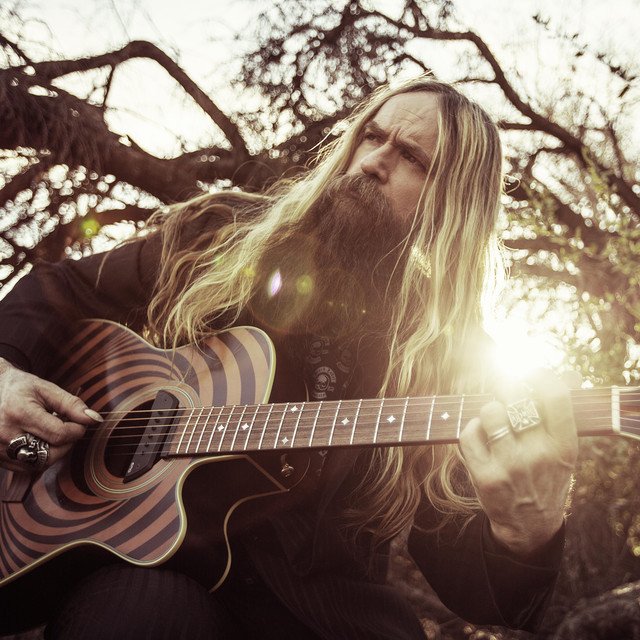
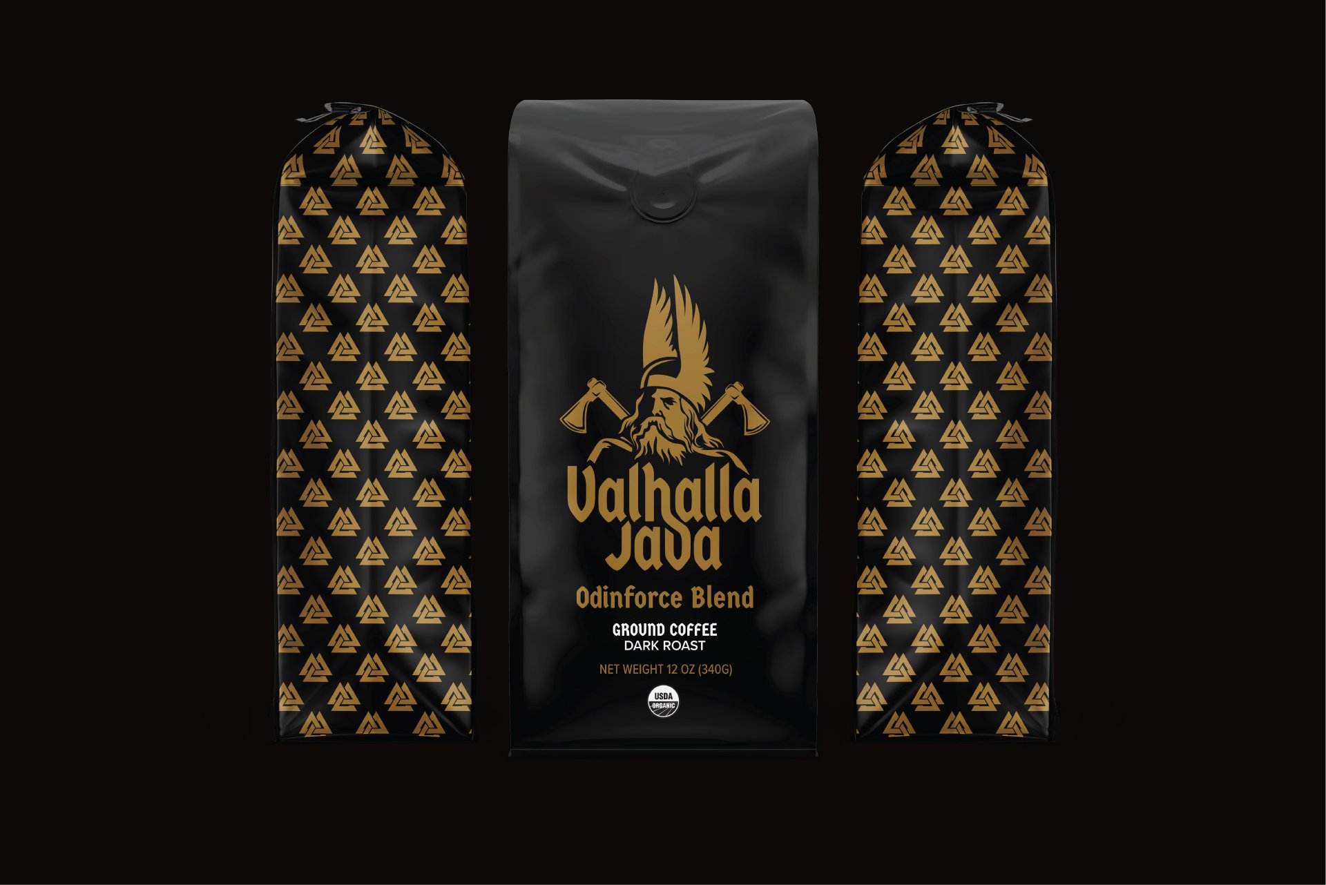
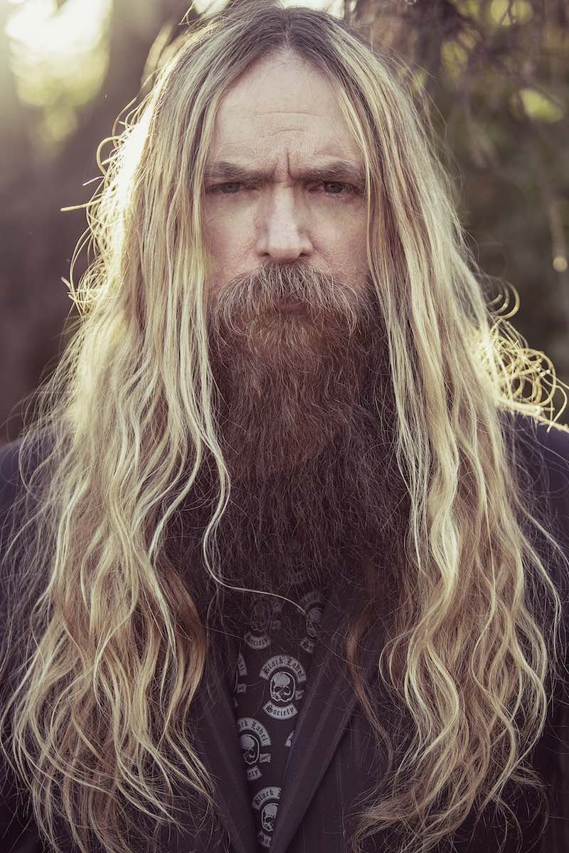
When a guitar god like Zakk Wylde lends his name to coffee, the brand needs to sing, or in this case, shred. The brief: rebrand Valhalla Java to embody Zakk Wylde’s persona, a deity of destruction, and convey that this brew is bold enough to wake the dead and carry you through the gates of Valhalla.
My Approach
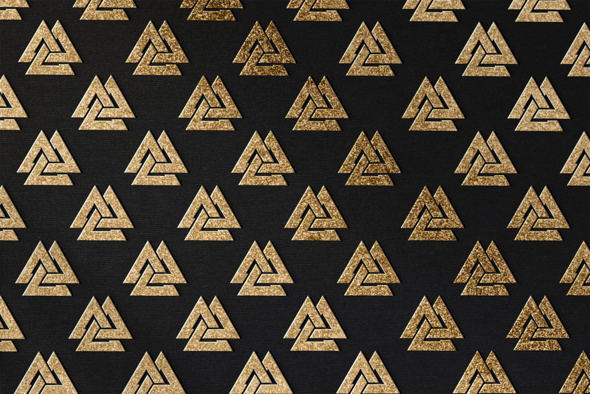
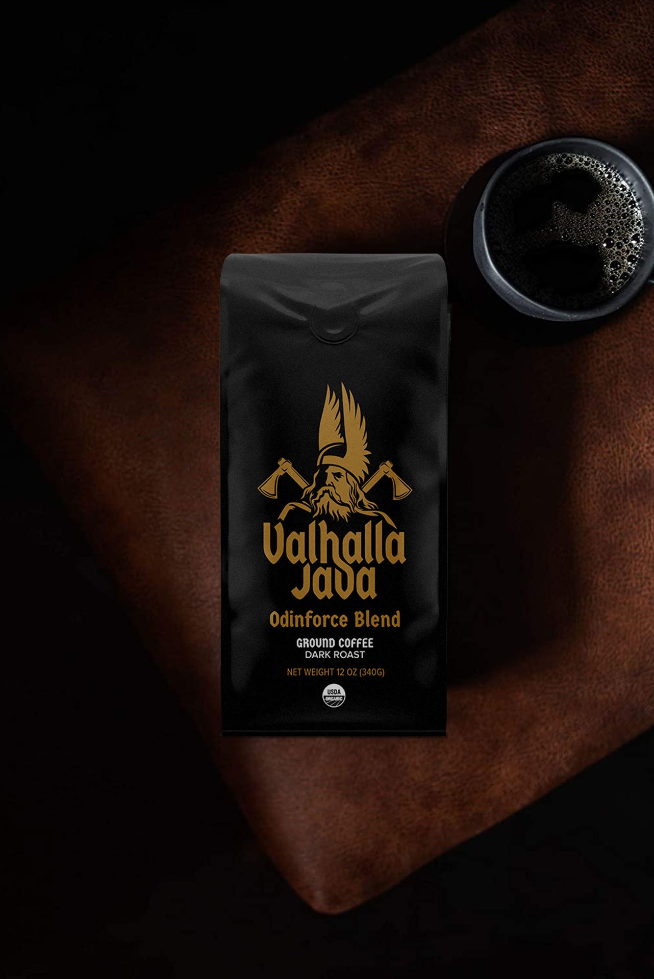
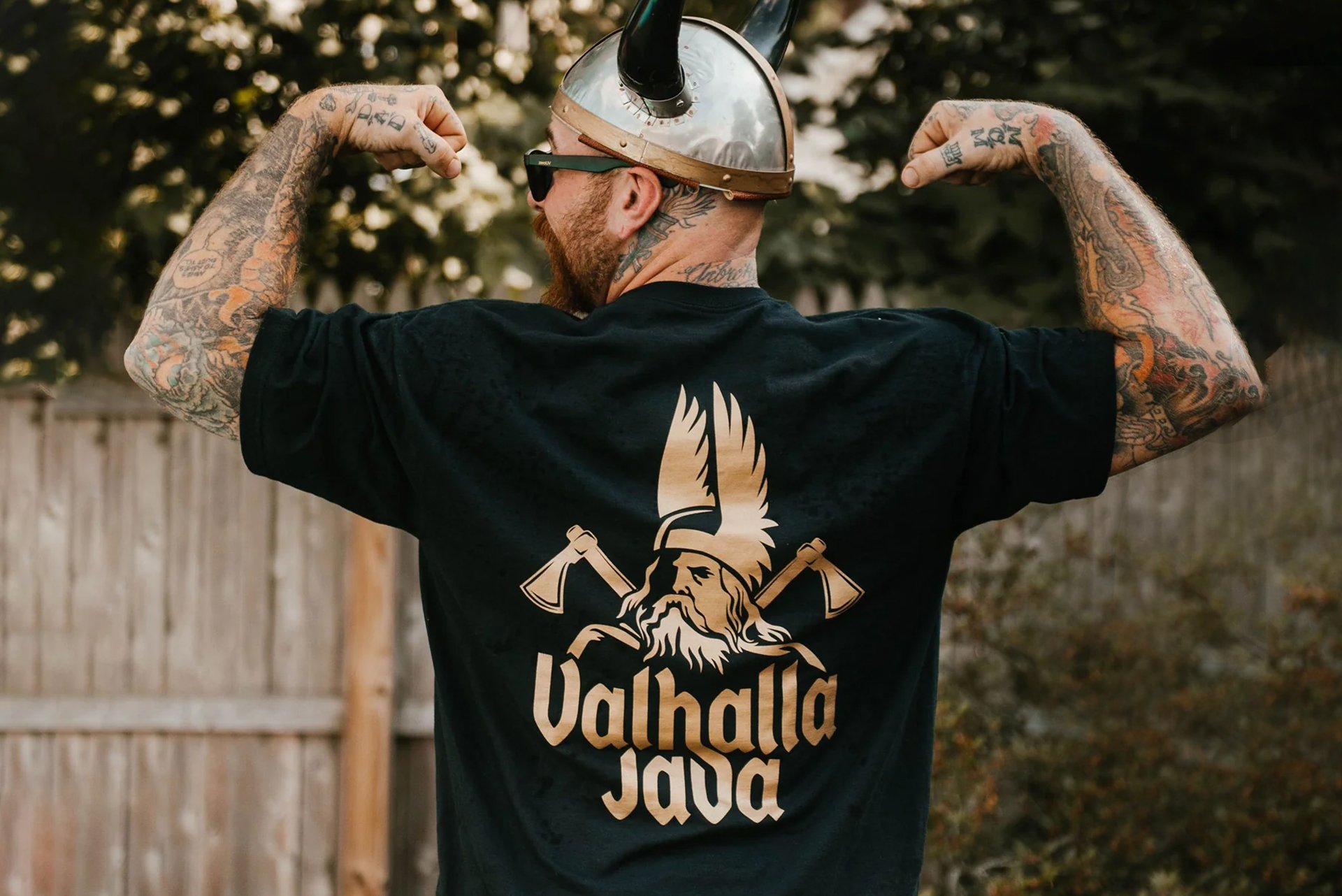
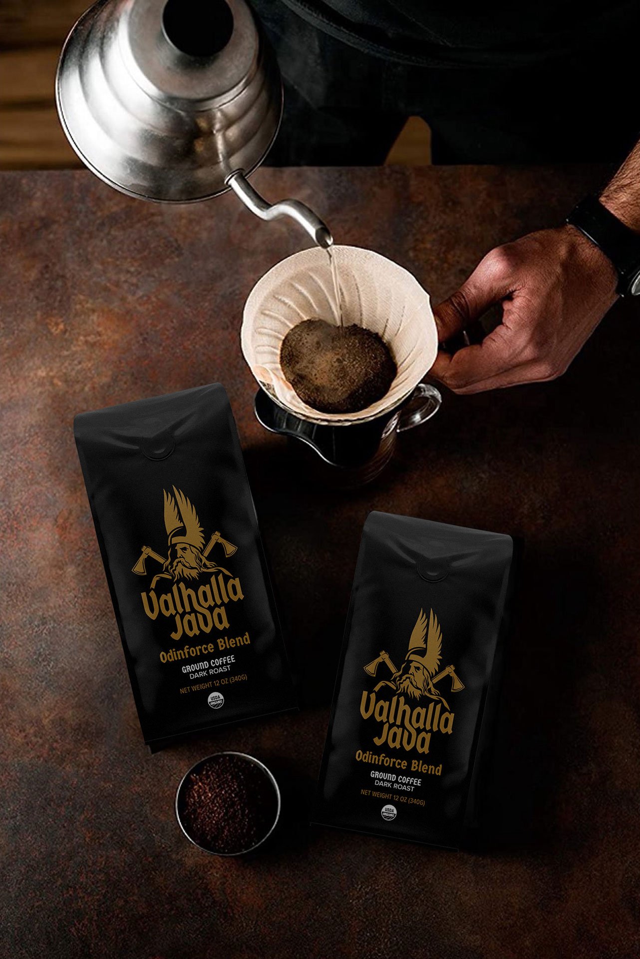
I channeled the essence of epic rock mythology into every design choice. From the logo’s weighty sense of gravitas to the packaging’s ornate patterns, every element feels as powerful and unmistakable as Zakk Wylde himself. Drawing from Norse mythology, the visuals evoke a warrior’s march, bold typography, dramatic iconography, and rich visual textures align to create a coffee experience worthy of legend. Strategic placement of runic patterns and dramatic silhouettes reinforces the brand's narrative, elevating the packaging into a storytelling device in its own right.
The Outcome
The resulting identity is striking and authentic. Balanced on the edge of myth and metal. The logo, patterns, and entire packaging suite look commanding on shelf and in merchandising contexts, appealing to fans of rock culture and collectors alike. It’s a brand that feels as powerful and unrelenting as its namesake, and just as memorable.
Why It Stands Out
This project encapsulates my ability to fuse personal branding with mythic design, translating an iconic musician’s identity into coffee packaging that demands attention. It demonstrates how visual design can feel as potent as the music that inspired it, marrying aesthetic boldness with brand resonance in a way that’s authentically, and unapologetically, metal, A.F.
Credits
Creative Director: Thomas Dragonette
Designer: Thomas Dragonette
Photography: Rachel Elliott